Thursday 28 June 2012

Chanel Sable Rose Bronzer and Chanel Calypso

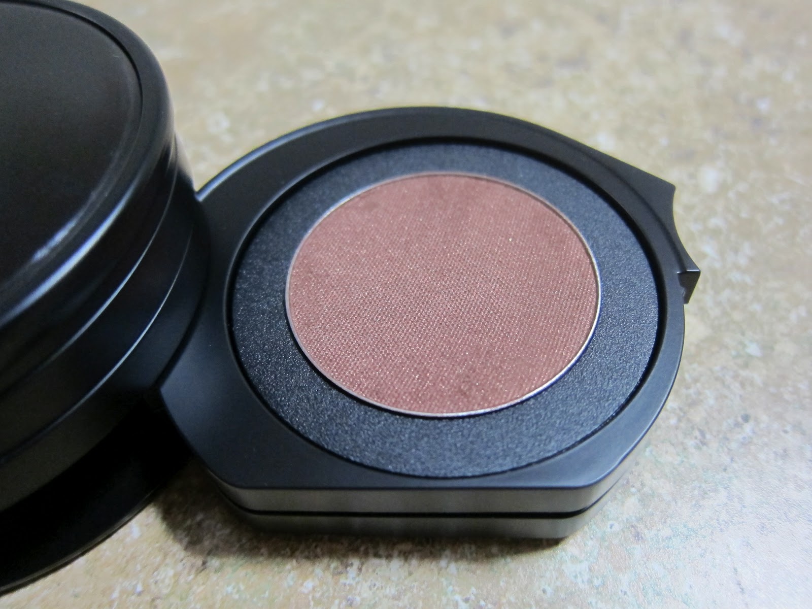
I think I'm in love!! To be perfectly honest with you, I have never found a bronzer that I truly liked. I mean, I have a couple of bronzers in my stash which I use occasionally, but I found them to be too orange/too red/ too fake. I guess I can afford to be a little picky because I don't use bronzer often anyway.

Chanel Sable Rose is hands down, the BEST, most luminous and natural looking bronzer I have ever tried on. Chanel is such an awesome go-to brand for face powders and this definitely does not disappoint.


Closer look at the strips in Sable Rose. I love using the 4th, 5th, and 6th strip together for highlight, and the top three to contour. If I want a light sweep of bronzer all over, I would use the brush it comes with and go over the surface top to bottom.

I have tried my best to swatch all the strips for you but they are so tiny!! My fat fingers couldnt pick up each distinct colour adequately (time to go on a diet...). Just look at the glow!


I also used the brush to apply the bronzer to my arm. Because of the rose tones, this bronzer is also suitable for a blush medium-dark skinned ladies. 

Typical of me, I have gushed so much about the bronzer that I almost forgot to feature Calypso. Calypso is my first ever Chanel lipgloss and I have to say that I am enjoying it a lot! 

Calypso in the tube is an almost neon orange coral with gold shimmers. When applied, the effect is more subtle and pretty (you definitely won't look like a beautiful person with strange orange lips LOL). I can see myself using up Calypso purely because of the colour and the beautiful fine shimmer. Chanel does microshimmer so well (I can also gush about their shimmery nailpolish if you like... haha).

Anyways, if you have a similar skintone to mine, I do recommend that you at least TRY Sable Rose and Calypso. I can almost guarantee that you will walk out the door with these two beauties (perhaps more, depends on whether your counter has the latest collection out yet). TWO THUMBS UP!!!

Cindy

Laura Mercier Moonlight Collection - Reviews and Swatches

As promised, here is my review of the Laura Mercier Moonlight Collection. On the left is the Bare Beam gloss, and the lipsticks on the right are Rose (bottom) and Mistress (top). Mistress was the GWP from my purchase. How nice is it to receive a GWP that is full size and is not some weird colour that no one ever buys?

Bare Beam is a delicious warm caramel with flecks of pink shimmer, Rose is a neutral-cool leaning soft pink, while Mistress is a bright red coral.

Bare Beam has a sickly sweet scent when applied. It lingers for a bit too, but the smell reminds me of their creme brulee body lotion (which I love!) so I don't particularly mind it.  Bare Beam is a little sticky and I can feel its "weight" when I wear them. From memory, I dont think that these are plumping lip glosses but I certainly feel a little more pucker-y when I have these on.

The two lipsticks apply with no discernible scents. They have a nice shine to them and applies very smoothly on the lips. The texture is so remarkable and I am very happy with the two colours I ended up getting.

All three lip products sit comfortably on the lips and the wear time is decent, about 4-5 hours.

Next, I have two eyeshadows for you. Deep Garnet, shown below, is a dark burgundy brown in the pan with bronze flecks. This shade reminds me a lot of the brown/violet sparkly shade in Becca's Balearic Love palette!! I must do a comparison soon :)


I also purchased Pink Pearl, a nice light baby pink with purple sheen. The shade is very opalescent. I love it! 

Laura Mercier eyeshadows often suffers from lack of pigmentation but I suspect that this is because she recommends using her eye shadow base/primer with all Laura Mercier eye makeup. Granite and Pink Pearl both have medium pigmentation, soft texture, and minimal fallout. Worn over a cream shadow (base), the lasting power is 8 hours.

I have arm swatches for you below below. From bottom to top, I swatched Bare Beam (ran out of arm space at the top there...), Granite, Pink Pearl, Rose, Mistress, Rose + Bare Beam (currently a lip combo I love to wear).

Personally, Rose applies a little too cool and too light on my lips so that is the reason why I warm it up with Bare Beam. 


I hope you have enjoyed my Laura Mercier post. Stay tuned for some Chanel goodness (oh my, Chanel! My one true LOVE).

Cindy

Tuesday 26 June 2012

Latest Hauls and Upcoming Reviews

I recently attended a couple of beauty events in Myer for beauty (power)houses Laura Mercier & Chanel. Like a hopeless makeup junkie, I went home with a few goodies. Thankfully, I had some restraint and did not buy everything from the collections. I will be reviewing the following items in the next couple of days (schedule permitting!).

From Laura Mercier's Moonlight Collection, I purchased a couple of eyeshadows (Pink pearl and Granite), a lipgloss (Bare Beam), and a lipstick (Rose), and the nice ladies at the counter gave me a free lipstick as GWP. Score!


A couple weeks later, I dropped by Chanel and picked up ONLY the latest bronzer in Sable Rose and the lipgloss in Calypso. That was a difficult day. I wanted so many more products from this Summer Collection. I urge you to at least give the bronzers a try. Best in class, in my humble opinion! If I had the chance to pick up more items from this collection, I would probably go with Sable Beige (the light coloured bronzer), the duo in Sable-Emouvant, and the eyeliner in Peche Cuivre. The nail varnish in Delight is also calling me. ARGH!!! So frustrating to be on a budget.


Lastly, I want to share with you some current go-to favourites from my stash. They are Le Metier de Beaute lip creme in Red Velvet, Le Metier de Beaute eyeliner in Artemis (this is HG for me, Love Love!), and Le Metier de Beaute eyeshadow in Water Sapphire. I purchased this eyeshadow from Nordstrom and it came completely shattered :( Lucky for me, Nordstrom agreed to give me a refund and on top of that, I was allowed to keep the shadow :D 

P.S: Sorry about the watermark, I took this photos with a different setting and I had to use a converter (Contenta) to be able to upload them onto Blogger :)

xxCindy

Monday 25 June 2012

Nars Habanera - An Old Favourite

Contrary to what you might believe, I haven't always been a fan of exclusively high end brand like Chanel, Dior, Guerlain or LMdB. Sometimes, if I see a colour I like, I might buy it eventhough it lacks 1.) texture, 2.) longevity. The Nars Duo in Habanera is one such product. For me, the texture of the eyeshadows are sub par, but the pigmentation packs a punch. I guess pigmentation is lower in my priority list because I do tend to favour more subtle makeup.

Nars Rubber Packaging is a gripe with me - it seems to attract fingerprints, dust, marks, etc.

Nars Habanera consists of a beautifully curated duo. On the left is a silvery blue green that looks slightly more silver in the pan but swatches show that the blue comes through strongest on the arm (and on the eye). On the right is a purple brown with flecks of green shimmers. This shade is a perfect accompaniment to to the blue green as it adds depth. However, use with a light hand as this shade can look slightly bruisey in huge amounts.


I have swatches of this duo below. Isn't it just fabulous? I need to do a look and show you just how great this looks on the eyes. My favourite way to wear Habanera is to place the silvery blue green on the mobile lid (freshens up the eyes) and the purple brown on the outer v and slightly on the crease. Finish off by lining with a jetblack liner and pat the purple brown on top.


The left side of Habanera is similar to Chanel IdO in Riviere, but its a little more blue and pigmented. Riviere is more silvery green. Side note, I need to print a retraction on my earlier review of Riviere. The initial disappointment with the colour itself is overshadowed by the fact that it looks so damn good on my eyes!!

What do you think about Nars Duos? Are you a fan?

xxCindy

Sleek Pomegranate and Flushed Blushes - Review and Swatches

Sleek is a UK based company that produces relatively good quality makeup at reasonable prices. Any makeup addict can probably agree with me in that being a makeup hoarder can cost a lot of money. So I do appreciate companies like Sleek and Wet n Wild (US) who really do try to give us the "best value for money". Being in Australia, nothing is cheap. The only low-mid end brand that I love are Natio and Bloom.


I got my hands on two Sleek Blushes in Pomegranate and Flushed. Pomegranate looks like a scary shimmery grape in the pan, but it applies like a blue toned raspberry red with pretty (not chunky) shimmers. Flushed looks like a shimmery deep muted red in the pan but swatches show that the shimmer do not translate. Instead, you get a beautiful flushed glow as if you've been running in the cold weather. 

Sleek Pomegranate
Sleek Flushed
The textures of these are not as soft as some my favourite blushes such as Burberry (I still need to blog about Burberry blushes!), LMdB (ditto...), and Laura Mercier. However, the harder texture ensures that we don't get the dreaded clown cheeks. You can pretty much any old brush with these and not make a mistake.

For example, I need to use a skunk brush and only juuuuuust touch the surface of my Illamasqua blush. Its a pain to have to monitor your brush to blush surface pressure for fear of putting too much on and look like an idiot.


Bottom Line: These are winners for me. The quality is excellent and you can buy them off Ebay for 11 AUD with shipping. How good is that?

xxCindy

Sunday 24 June 2012

Becca Lost Weekend Palette - Review and Swatches

I have been postponing this review for a while, mainly because its difficult for me to be unbiased when it comes to Becca. Some of you might know that Becca was developed by a Perth based makeup artist, and maybe its the sense of "ownership" and pride over a home grown brand that makes me love everything that I buy from them.

The Lost Weekend Palette was no difference. The colours are soft and muted, right up my alley. These are the colours that I wear on a daily basis to the office. I work in a somewhat conservative environment where most of the women wear little to no makeup at all.


A shot of the back of the palette...


Look at how beautifully natural these colours look on my skin. I think this is what I love *most* about the brand. Effortless beauty. 

Moleskin is a mauve taupe that is almost undetectable on my skin, with a slightly harder texture that is akin to all Becca's Matt shadows. There was little fallout and the pigmentation is sheer to medium. It performs very well over a base/cream shadow. Chino is a beautiful milk chocolate. The texture is, again, a touch harder than I like. The last shade, Moire, is a shimmery lilac taupe. The texture is dreamy and soft and the pigmentation is medium.

L-R: Moleskin, Chino, Moire
Bottom Line: Probably not a must if you have Enigma. I do love the wearability of all three shades so I don't regret buying this palette one bit. You only need to mention the word taupe and I will probably rush out and buy it.

Hopelessly In Love with Becca...
xxCindy

Laura Mercier Metallic Creme Eye Colour in Gold - Review and Swatches

For a change in pace, today I will be reviewing one of the workhorses in my eyeshadow collection. I always use a cream eyeshadow under all powder shadows because I have really oily eyelids, and without them, eyeshadows just don't stand a chance. They fade, crease, and move around and look simply terrible after about 4-8 hours wear (depending on which brand of powder eyeshadow I use, Nars would last me 4 hours and LMdB would last me 6-8 hours).

Up until now, I have been mainly using Shu Uemura's cream eyeshadow in P Beige. Its a pearlescent flesh colour that perfects the colour of my eyelid and its a little sticky so it holds powder eyeshadows nicely in place.

I purchased this Laura Mercier Metallic Creme Eye Colour in a blog sale. I was so excited to try another brand of cream eyeshadows, especially since its from one of my favourite makeup brands for foundation! :)


I have swatches for you below. I tilted my hand slightly in the second picture so you can see the gleam that you get from this metallic shade. I really really love this! It will not replace my Shu Uemura cream eyeshadow as a daily base for my eyeshadows because the Shu is more versatile in that it will be suitable for any colour you choose to wear over it. The Laura Mercier Gold will have to be reserved for low-key weekends where I want a no-fuss look wearing it on its own, or on a fancy night out for a bronze smokey eye.


The texture is quite runny and spreadable, comparable to Becca eye tints (perhaps a bit creamier). I found no problems at all with blendability. The coverage and pigmentation is medium and buildable, which I prefer as opposed to richly pigmented products because taking away pigmentation is much more difficult than adding.


Bottom Line: Worth the investment. I urge you to try Laura Mercier cream eyeshadows as they have a very versatile and wearable colour selection! Laura Mercier can be found in selected Myer and David Jones counters.

Have a Happy Monday!!
xx Cindy

Monday 18 June 2012

LMdB Chauvet Pont D'arc Kaleidoscope - Review & Swatches

Updated: I did take a myriad of other photos with my camera of each tier from top to bottom but alas, I did not have time to upload them today. I will update this feature tomorrow with those photos. New photos have been added! :D Enjoy <3
 
My Zuneta order came yesterday and I was so delighted to open up my new LMdB Kaleidoscope in Chauvet Pont D'arc . Here is the promo spiel from Zuneta if you haven't already seen it a gazillion times before:

The Chauvet Pont d'Arc Kaleidoscope Eye Kit, ($95, shown above), for Summer 2012 was inspired by the Chauvet Cave Paintings in France, the oldest in the world. The cave paintings, found in Chauvet Pont d'Arc, which is located in the south of France, are among the most significant prehistoric art sites known to mankind. The hues are richly pigmented - beautiful and intense. Painted by ancient artists wielding extraordinary skills, the images evoke the burgeoning life of centuries long past and, with protection, will last and be enjoyed for eternity.

The shades in Chauvet Pont d'Arc are:
  • Umber - umber-toned satin mauve
  • Ocher - shimmering sandstone ocher
  • Madder - shimmering terracotta
  • Crystalline - silky matte desert teal


Umber is a really lovely irridescent mauve. The texture of the shadow is soft and buttery with medium level pigmentation. If you really blend this shade out, it becomes a sparkling light mauve and I can see it being a gorgeous standalone shade for the office.


Ocher is a darkened dirty shimmering gold. This shade is again very soft and buttery and is the most pigmented shade in the kaleidoscope kit.


Madder is a gorgeous teracotta shade with small silver shimmers. Compared to the top two tiers, this shade is noticeably less shimmery but it is not matte either. The pigmentation level is medium.


Crystalline is a bright teal which is a little chalky and is probably the sheerest out of the four. However, I would never call this shade sheer. The pigmentation is definitely there, but the chalky texture makes it a little difficult to blend and there is some fallout when you apply this as a liner.


I took a crappy phone pic this morning before I rushed off to work and this is how Chauvet Pont D'arc looks on me. Its a little difficult to show the dimension and the intensity of the colours but I hope you get the picture.

Couches de Couleur #1: Top three tiers layered, fourth tier added as a liner
Couches de Couleur #2 : Madder all over, Crystalline dabbed over that, concentrating on lower lashline, Ocher applied on the middle of the eyelid, and Umber to blend out edges
The photo above was taken four hours after application, and it was late at night after my anniversary dinner with the hubby so please forgive the photo quality :)

Couches de Couleur #3 : Umber all over the mobile lid and slightly past the crease, Crystalline lightly dusted over Umber, Crystalline used as liner

This photo was taken 4 hours after application, using Couches de Couleur #2


Bottom Line: This is one of the best kaleidoscopes from the recent releases of kaleidoscopes in my opinion. The one kaleidoscope which possibly tops Chauvet in terms of usefulness, creativity, and quality would be the Blush Kaleidoscope. I do suggest that you run to your nearest LMdB counter or Zuneta to purchase this kit. For reference, my skintone is Sand Beige in Laura Mercier Silk Creme, which is about NC37 (Mac).

Have a good start of week!

xx Cindy

Monday 11 June 2012

Mix & Match with Le Metier de Beaute

I have been experimenting lately with my current stash of LMdB's lip products and my very first try of mixing ended up so successful, i just had to share it with you!

L-R: LMdB Summerland, LMdB Fraise Creme

L-R: LMdB Fraise Creme, LMdB Summerland, Fraise Creme + Summerland

L-R: LMdB Fraise Creme, LMdB Summerland, Fraise Creme + Summerland
Here is a terrible photo of me wearing this lip combo. Sorry folks! I will try and do better and update this post when I can :)


If you already have these two lip products, please do give it a try.

xx
Cindy

The Chauvet Pont D'arc Kaleidoscope is now available on Zuneta.com!!

Hurry international shoppers!! Here is your chance to grab Le Metier de Beaute's Summer Kaleidoscope for 2012.

I have seen the swatches of this and it will not disappoint. 


Here is the link, and use the code ZBEAUTYBIBLE for an extra 10% off. If you pay with your credit card, Zuneta automatically takes out the tax (its a bit more difficult with Paypal). I paid roughly 60 pounds for mine :)

GO lovelies!!

ETA: The blush kaleidoscope is also available again here

xx Cindy