Wednesday 23 May 2012

Sephora + Pantone Apricot Brandy Blush - A BTiB Giveaway

My dear readers,

I follow a lot of beauty blogs, but I only read a select few religiously. One of these blogs is Best Things in Beauty. Charlestongirl is probably the only blogger who consistently blogs (daily!) and I love reading about her newest finds :).

I was lucky enough to have won her Sephora+Pantone Apricot Brandy Blush giveaway and I was ecstatic to receive this as the reviews for this collection had been just amazing.


Look at the packaging! Isn't it great? When my husband saw this, he asked, "So how much money did you spend on this??" Haha clearly he thought the packaging warrants a hefty price tag but as you all probably know, the Sephora brand is really affordable.


Apricot Brandy is a sheer sparkling orange with gold shimmer throughout.


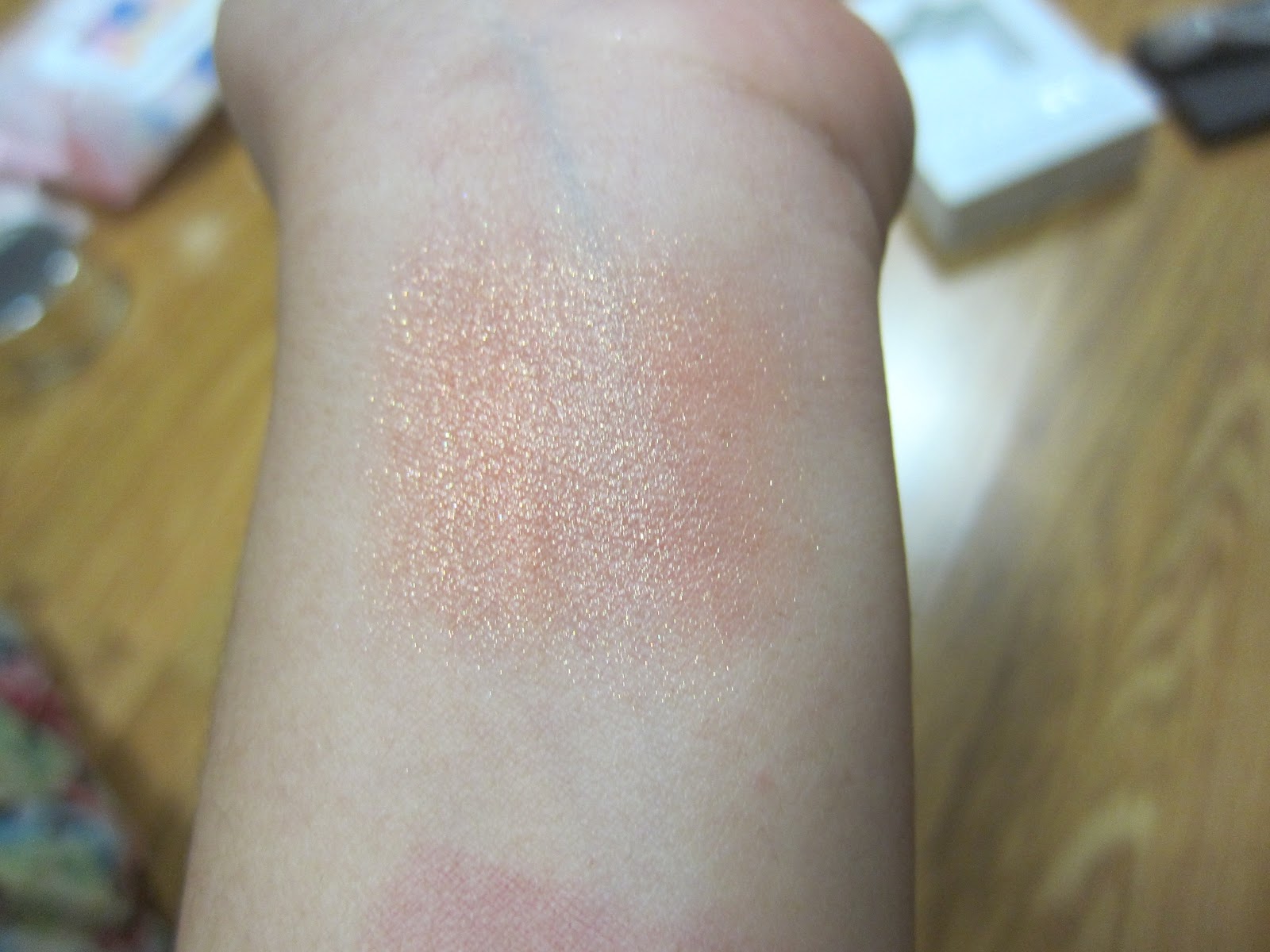
Another swatch photographed in dim lighting to show the gold shimmer and the slight brown undertone to the blush. Its a very unique colour - I'd hate to say that is a slightly dirty, shimmery orange but that's what I see with my eyes. 


Another shot of the blush on my finger. The intensity does not get imparted onto the skin when applied. I think this makes this orange blush very wearable and a definite winner for me!

The texture is a little harder than I would like. I usually use my Nars Yachiyo to apply blush, but I think a denser, coarser brush will need to be used to pick up pigment from Apricot Brandy. 


Bottom Line: Use with caution if you don't like shimmer. Exfoliate before using this because it is the most shimmery blush that I own and it will highlight imperfections on your cheeks. If you are blessed with good skin, then blush away with Apricot Brandy! :D

Cindy

LMdB Autumn Embers Kaleidoscope (Vintage): A Kaleidoscope A Day...

Hello!!

I feel like I haven't been blogging in a looong time, and its time for me to rectify that. Forgive me, but I have been feeling a little under the weather lately and posting just seemed like too much effort.

This is the last installment of my A Kaleidoscope A Day post. It is with great pleasure that I present... *DRUM ROLL*... Autumn Embers!


The top tier is a translucent peachy pink gloss, the second tier is a sheer berry gloss, the third tier is a pigmented khaki gold lip creme and the bottom tier is a beautiful blue-red lip creme. For anyone who is interested, yes, the last tier is a dupe of the red lip creme in the Empress Kaleidoscope lip kit. Lucky I love this shade! ;)


Since Autumn Embers is a relatively old kaleidoscope, I noticed that the texture is a little bit harder than a fresh kaleidoscope. So if anyone out there is hoarding lip kaleidoscopes and not using them - WHY?? Creams, lotions, gels etc have a use by date. I plan to make this kaleidoscope a necessity in the fall just so I don't waste any cream products :)

I have recently updated my blogsale with new items. Please head on over and see if you like anything from my list :).

Wednesday 9 May 2012

Shu Uemura P Wine 25 and P Wine 29 - Review and Swatches

Shu Uemura makes me happy. Ridiculously happy.

So, by now you would realise that I am a blush fiend. I have two cheeks, but I have a whole case full of blushes. Other people have (healthy) hobbies like fishing, and golf. I collect makeup as an obsession "hobby".

P Wine 29, P Wine 25
P Wine 29 is a matte rose on me. It has a smidgen of violet in it, but I honestly don't know why this falls in the Wine colour category. Regardless, its gorgeous!

P Wine 25 is a bright cool blue-based pink with fine shimmer throughout. This shade is brightening and will perk your complexion up if you feel that your skin looks a bit dull.

I prefer P Wine 29 since it looks more natural on my skintone, but P Wine 25 is the more unique colour of the two.

Obviously these are quite hard to find following Shu Uemura's revamp of their whole blush collection. If anyone is interested, though, I am more than happy to bring these in store and see if they have dupes or repromotes in the current collection.

And here is a snippet of my and hubby's old engagement photos =) I love looking though old photo albums. So many memories!


Cindy

Etude House Nail Art

I had the house all to myself yesterday night and since dear hubby *HATES* the smell of nail polish, I took my golden window of opportunity and did my nails. Ha! Yes, dear, there is a lingering smell of varnish in the air, isn't there? Hmm wonder where it's from?


Get the look : Le Metier de Beaute Two in One Base/Top Coat, Essie Mademoiselle, Etude House Nail Art Stickers

I bought mine while travelling to Indonesia last year but you can easily purchase them from Ebay with 400% markup  (but its still cheap!!).

Cindy

Les Artistes (Vintage): A Kaleidoscope A Day...

I've had Les Artistes for a couple of days now and even though I have only used it once, I can see this palette being very handy when I need a no-brainer look.

I have quite pigmented lips, so the layered colour of Les Artistes is a very light pinky nude that is perfect for any occasion. I think Les Artistes and Empress will become my staples this fall and I can foresee my running out of these quite quickly. Btw, have I mentioned that I hit pan on Empress?? That's true love, right there. Sorry A =P

Top 2 tiers
Bottom 2 tiers
Swatches...


These vintage kits are near impossible to find now, but not to worry, I am sure you can duplicate the look using the permanent range of lip glosses and lip cremes from LMdB. I really love the Couches de Couleur swatch of this lip kaleidoscope. I wish I can find another for backup!

Cindy

Tuesday 8 May 2012

LMdB Modernist Merlot (Vintage-ish): A Kaleidoscope A Day...

Day 2: Modernist Merlot. Oh dear. What a contrast this is going to be to my first installment of "A Kaleidoscope A Day..." posts.

Modernist Merlot does not warrant the name Kaleidoscope Kit, because the truth is, the layered result is really flat and one dimensional. The shades are a shimmering mauvey taupe, a dusty matte pink, a deep lightly shimmering browned wine, and a really really sheer grape.


Hmm. What can I say? This palette was beyond disappointing. If LMdB wants to continue charging their customers 95 dollars for each kaleidoscope (plus tax!), they better step up their game. My search for real vintage kaleidoscopes continue, as I believe that they were the best LMdB ever made.

Cindy

Aurora Inspired FOTD

I asked Anna to model some makeup for me on the weekend and after much discussion, I decided on an Aurora inspired Face of The Day post :)

We were blessed with rain and clouds on the day so I could not get many nice photos but I hope you enjoy them regardless.

"In northern latitudes, the effect is known as the aurora borealis (or the northern lights), named after the Roman goddess of dawn, Aurora, and the Greek name for the north wind, Boreas, by Pierre Gassendi in 1621. Auroras seen near the magnetic pole may be high overhead, but from farther away, they illuminate the northern horizon as a greenish glow or sometimes a faint red, as if the Sun were rising from an unusual direction."


My hand is going to star in this particular pic... =P


Taken From: http://newspaper.li/northern-lights/
For this FOTD, I used the following products on Anna:

Face - Shu Uemura Stage Performer Instant Glow, Chanel Vitalumiere Aqua Foundation #B40, Laura Mercier Translucent Loose Powder, Laura Mercier Secret Camouflage #3

Cheeks - Giorgio Armani Sheer Blush #5, Kevyn Aucoin Shadore, Bobbi Brown Bronze Shimmerbrick

Lips - Le Metier de Beaute Aurora Lip Kit (reviewed here)

Eyes - Mac Pigments in Grape and Teal (Grape as base, then teal on the inner eyelid area and to blend outer edges), Heroine Kiss Me Make Long & Curl Mascara

What do you think? Does she look gorgeous or what?!?

Cindy

Giorgio Armani Beauty Écailles Collection for Summer 2012 - Eyes to Kill Intense Silk Eyeshadows Review

Giorgio Armani released the Écailles collection for Summer 2012 and I purchased all four limited edition Eyes to Kill Intense (ETKI) shadows. Beauty Ops has covered the latest ETKI offerings quite extensively and she was actually the reason that I purchased all four shades!

L-R: #23 Madre Perla, #20 Obsidian Black, #21 Obsidian Grey, #22 Ecailles

I have shown two swatches for each shade (normal and sheered out). I found it especially difficult to show the shimmer in Madre Perla. It looks like a flat boring old white but that is definitely not the case. It has pretty green and pink shimmer to it!   


All of the ETKIs from this collection are beautiful, pigmented, smooth and long lasting. The stand out shade for me is definitely #20 Obsidian Black. It is not an easy task to create such an attention-grabbing black eyeshadow, and Giorgio Armani has definitely done so with this shade. The teal glow is mesmerising.

Even though this was not the most well thought out colour selection for summer (I would have thought brights and corals - y'know, something to welcome warm weather), Armani still managed to put out a well coordinated colour palette, both within the limited edition ETKI range as well as the entire collection. I guess blues and grays are the new trend for Summer :)

Cindy

Monday 7 May 2012

Chanel Illusion d'Ombre in Riviere - Asia Exclusive

When I first heard about the Asia Exclusive Chanel IdO Riviere, I was so excited!!! I immediately said "Yes!" when my friend in Hong Kong asked me if I wanted it.

I received her parcel some weeks ago and I hesitated to write this review because I didn't want to speak ill of my beloved Chanel. But alas, I am sad to bring you my first disappointing IdO purchase.


Don't get me wrong, I think the colour is lovely, but I do feel like the pigmentation is quite a bit sheerer than the rest of the line. Its still worth taking a look if this is a colour that you think you'd wear all the time. I have used this quite a few times, and the result is a silvery mint green (more silver, less mint green) and it is very daytime/office appropriate.


I really hope I haven't dissuaded anyone from swatching this in store. My love of Chanel and IdO's know no bounds but I just think that this particular colour is not very well executed.

Cindy

LMdB Aurora Lip Kit : Review and Swatches

If you remember my Spring Collection Highlights post, I mentioned that LMdB was coming out with three kaleidoscopes in the Spring; one eye kit called Northern Lights, one lip kit called Aurora, and a Blush kaleidoscope. 


Aurora Lip Kit is a lip palette of cool and warm pinks. It has two shimmer and two satin lipcremes. The first and third tier (shimmer) are quite sheer but buildable. The consistency of these are quite thick but never sticky. The second tier (satin) have a more traditional lipstick texture. Its pigmented and dryer/less thin. The last tier (satin) is an almost neon pink. The consistency is like a gloss and it has medium pigmentation. 

Swatches (L-R) are from the top tier to bottom tier.The colour descriptions from Le Metier are spot on, so I shall be repeating those for you instead of trying to describe it myself...(from top to bottom)
- Illuminate (shimmering, hot pink with a sheer finish)
- Voltaic (satin-nude mauve)
- Dynamos (effervescent coral-tangerine)
- Eos (opaque fuchsia)
 
Both photos are taken indoors with artificial lighting. I don't come home early enough these days to be able to snap nice photos outside but to my eye, the second swatch photo is reasonably colour accurate.

What do you think? Will you be buying Aurora??

I will be featuring a FOTD post soon featuring this lip kit and it will be Aurora themed ^.^ I asked my gorgeous friend to be my model and I just can't wait to show you the photos!

Cindy

LMdB Chinoiserie Azure (Vintage): A Kaleidoscope A Day...

Day 1: Chinoiserie Azure. Where have you been all my life? 

Its hard for me to explain just how *surprised* I was when I touched the surface of the shadows. I always speak about how amazingly soft and buttery LMdB shadows are. Chinoiserie Azure (CA for short), is that times ten. 

I think I've made my feelings quite clear on various blogs that the recent releases of kaleidoscopes are a disappointment (I may have even offended Mikey, the Creative Director himself! See here). When I received Chinoiserie Azure in the mail, I was even more convinced of this.


Each Swatch is a single swipe, Couches de Couleur application at the top
All of the shades in this kaleidoscope are buttery smooth (wait, I said that already didn't I?) with the exception of the matte shade which is a touch harder. However, it makes this shade perfect for lining the eyes and it just makes me love this palette soooo much more. 

The pigmentation is faultless. The third tier is barely visible on my arm, but this is not due to lack of pigmentation. Its just too close in colour and tonality to my actual skin colour.

Overall, this is an absolute stunner!! I wore this kaleidoscope today with Les Artistes and I was so taken aback by the result. Chinoiserie Azure gives a unique twist on blue and the champagne pearl from the duochrome light blue (second tier) and beige champagne (third tier) really comes through on your eyes for that kaleidoscopic effect.

Cindy

Its raining Vintage Kaleidoscopes today!

A really lovely lovely lady swapped me four (!) vintage Le Metier de Beaute kaleidoscopes and they arrived yesterday, to my delight and my husband's dismay. I received Chinoiserie Azure, Modernist Merlot, Les Artistes, and Autumn Embers. I shall discuss and review each one with you in the next few days. 

From top left (clockwise): Les Artistes, Autumn Embers, Chinoiserie Azure, Modernist Merlot


If you were wondering, the kaleidoscopes are resting on my and dear husband's engagement photo album. I was feeling a little nostalgic yesterday and pulled it out to look at our old photos! 

Cindy